How to Design a High-Converting Landing Page?
Most businesses are online for one of two reasons (and often both).
The first is to generate exposure, engage with prospective new customers, and build trust. In other words, it’s a branding play.
The second reason is to generate revenue. And one way you generate revenue is by leveraging good landing page to procure traffic and convert it into dollars.
But simply having or a creating landing pages isn’t enough. It needs to be optimized for conversions to generate leads. Conversions often mean more than just user interface (UI), UX design but also must have quick landing page load time. It’s about combining design with statistical feedback.
And in this blog post, we’re going to walk you through the specific tips, tactics, and best practices for designing high-converting visitors effective landing pages that ultimately produce sales.
What is a Landing Page?
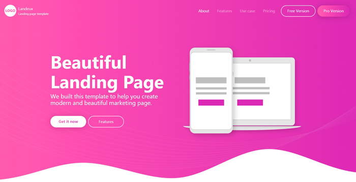
A landing page is basically a standalone web page that’s developed for a specific purpose (also known as a conversion or campaign goal). The idea is to drive targeted traffic to the landing page and then use the design, great copy, and layout of the page to convince the visitor to follow through on a specific action.
Examples of desired actions include:
- Purchasing a product
- Signing up for an email list
- Grabbing a lead magnet (like a downloadable eBook or report)
- Joining a membership program
What makes a good landing page different from any average product page on a website is that it’s highly focused. There’s typically an external ad campaign happening on social media to carefully target prospects who are most likely to convert visitors.
You can think of a good landing page layout as a distraction-free zone.
Whereas a home page hits the visitor with a bunch of different content and calls-to-action – visit this page, contact us, sign up here, etc. – a landing page is wholly focused on doing one thing.
This allows the design and copy to all work cohesively – rather than being at odds with one another.
The flexibility of your landing page is likely to be very different depending on your content management system (CMS). Despite it’s popularity, not all websites and landing pages should be built on WordPress. Its less expensive (at least on the surface) price point might be compelling, but it’s certainly not a one-size-fits-all solution for website design.
Done well, this results in better results and higher conversion rate.
Landing Page Design Best Practices
While everything on a landing page works together, we’re going to split up the best practices and tips into two categories: design and copy.
Let’s begin with design:
1. Simple Sells
If you study the difference between high converting landing pages and those that underperform, you’ll notice that the former tend to be much simpler and more streamlined. And that’s not by accident.
The human brain, as complex as it is, doesn’t do well processing multiple pieces of information at once. As much as we may pride ourselves on our ability to multitask, we’re notoriously bad at it.
If you want to drive conversions, keep things simple and focused. Eliminate distractions and dial your design (and content) in.
What counts as a distraction? Basically anything that doesn’t directly drive a visitor to perform the desired action. If it’s non-essential, it’s a distraction.
Use plenty of negative space (also known as white space) to avoid overwhelming the sense. You definitely want to stimulate, but you don’t want to put so much emphasis on the design that people are unable to engage with the copy (which is ultimately responsible for converting).
2. Stay Above the Fold
Do you remember newspapers?
(That’s sort of a joke…but not really.)
Newspapers traditionally come folded in half – creating a crease that delineates the top from the bottom.
Anything design or text that’s on the top half is known as being “above the fold.” This is the content that gets the visibility on newsstands. The graphics and copy on this half of the cover get the most eyeballs.
We use this same terminology in best landing page designs.
When designing landing pages, you have to assume that nobody is going to go below the fold. And if you want people to, you have to win them over above the fold.
But what really needs to go above the fold?
You obviously need to keep it simple…but what’s essential?
At a bare minimum page sections, you need to include a headline, sub-head, call to action (CTA button, social media sharing buttons and some sort of visual hierarchy that connect everything.
3. Trust Signals Convert
Whether the goal of your great landing page is to get people to give you their email address or purchase a $2,000 product, you have to build trust before you can move them to action.
One of the best ways to do this is with trust signals.
A trust signal can take on any number of shapes and forms, but it’s basically a design element that makes people feel more secure. Landing Page Examples include:
- Money back guarantee emblems
- Social proof (quotes and reviews)
- Trust by association badges (e.g. logos of companies you’ve worked with)
Run with your best trust signals above the fold and then gradually splice in additional ones as people scroll.
4. Leverage Principles of Color Theory
The colors you select for your landing page have a direct impact on conversion rate. Every tone on the color wheel has a psychological association. And depending on how and where you use certain bright colors to have high contrast, you can trigger different emotions in your visitors. Here are some great example:
- Red is passionate. It promotes urgency and is tied to courage, excitement, and warmth.
- Blue is a trustworthy color. It’s often associated with loyalty and sincerity. It’s also a logical color for situations where people need to make calculated buying decisions.
- Yellow is seen as optimistic and youthful. It’s creative, friendly, and motivating. It can also be overwhelming at times.
- Green is associated with wealth (for obvious reasons). It’s also tied to growth, balance, refreshment, and environmental causes.
This is just a small sampling, but it gives you an idea of how important color selection is – especially when you’re combining multiple colors to establish a perfect landing page color scheme.
5. Use Directional Cues
As elementary as it may seem, good landing pages utilize directional cues like arrows, pointers, buttons, and other visual signposts to show people where to click or engage. They’re especially effective when implemented above the fold (in an effort to get visitors attention to scroll below the fold).
In addition to basic directional cues, you can use striking images/pictures of people pointing. Even an image of someone looking in a certain direction can coax people into looking at a specific portion of the page.
Landing Page Copy Tips
Design is arguably the most challenging aspect of developing high-converting landing pages, but it’s far from the only one. Nowhere is this more true than when designing ecommerce websites.
In order to move people to action, you have to utilize the correct copy in the proper place.
Here are some of our favorite (and highest returning) tactics:
1. Write Like Your Target Audience Talks
Brands often get caught up in corporate speech. This where you start using language that you use in internal documents and stakeholder reports. And while you can get away with a little of this language on your website, it doesn’t fly on a great landing page.
To drive conversions, you must write like your audience talks. Use their words, tone, and inflection. This helps you build trust and make them feel comfortable in the sales process.
2. Make Them the Hero
As much as you might think you’re the hero that your potential customers need, this is not the way customers think. If you try to make your brand the hero & draw attention, you’re missing the point.
The best landing pages acknowledge the friction the visitor has and then provides a solution that positions the customer as the hero. The brand voice is simply the guide – connecting the buyer to the solution with emotional connection.
What does this look like in practice? Make the effective landing page about them, not you.
3. Use Action Words for call to action (CTAs)
As simple as call to action CTA button copy may look with a simple message, it’s actually one of the hardest parts of effective landing page copy to get right.
Avoid the temptation to use basic calls like “Buy Now” or “Click Here.”
Instead, try more pointed and action-oriented phrases like:
- Learn more
- Discover what’s inside
- Get yours today
- Join for free
- Claim yours
- Explore
- Get 25% Off
Do you see how much more aggressive these phrases are? They get people to click, rather than hover.
4. Write in Second Person
The worst thing you can do on a landing page is write in third person. It’s cold, corporate, and disengaged.
Visitors want to know that you’re talking to them.
You do this by writing in second person and using lots of “you” language.
This creates a personal relationship between you and your reader. It makes them feel special, cared for, and heard.
And as long as you’ve done a good job of researching your target audience and driving the right traffic to the page, you’ll hit the nail on the head.
5. Keep it Punchy
The final tip is to keep your copy short, tight & eye catching.
Long, dense paragraphs don’t work. They overwhelm people and fail to properly convey meaningful ideas.
To win with effective landing page copy, use lots of one-sentence paragraphs, short phrases, and spatial separation.
As the world’s best marketers say: Let your copy breathe!
Landing Page KPIs and Metrics for Tracking
You can follow every single one of the tips and best practices outlined in this article, but that doesn’t necessarily mean they’re going to work for your brand, your product, or your call to action (CTA).
Every situation is different and there are hundreds (if not thousands) of variables in play.
So while we recommend you try as many of these tips as possible, we’re not telling you to blindly trust that they’ll work.
The key points to effective landing page success/successful landing is to study the data and optimize accordingly.
In other words, push a version of your landing page out, driving visitors/drive more traffic to it to have more leads & more conversions, and then wait until you have some data. Based on this information, you can tweak different other elements to bolster conversions.
You’ll have to decide which ones are most relevant content for you specific goals, but here are some good metrics and key performance indicators (KPIs) that generally provide clarity and direction:
- Traffic numbers. Raw traffic numbers are important, if for no other reason than to confirm that your page is being seen. In isolation, this number doesn’t matter a whole lot. But it’s used to calculate conversion rates and cost per conversion (which will be discussed below).
- Sessions by source. More important than raw traffic is the sessions by source. This tells you where your traffic is coming from. You can narrow it down by channel (social media, email, etc.), as well as individual sources (Twitter, Facebook, Instagram, etc.).
- Goal conversions. Every analytics platform – whether it’s Google Analytics or a dashboard built into your landing page tool of choice – has some sort of goal conversion tracking. This allows you to see exactly how many visitors are following through on the desired action. At the end of the day, this is the only number that matters. (Though the rest of them feed into this figure.)
- Average time on page.This metric tells you how long each visitor is spending on the page. Generally speaking, longer average time on page results in higher conversions. (It’s an indication that people are engaging with the content.)
- Bounce rate. This metric tells you the percentage of visitors who leave the page without going to another page on your website. A high bounce rate indicates one of two things: (1) You’re procuring the wrong type of traffic, and/or (2) Your landing page design/copy isn’t compelling enough to move people to action.
- Form abandonment. If you have some sort of opt-in form on your landing page, this is an interesting little metric. It tells you a lot about how visitors are engaging with your landing page. It tracks people who start filling out a form and then leave the page. Good form abandonment metrics will tell you how many fields they completed and where they dropped off.
- Cost per conversion. This final metric is a good one if you’re driving paid traffic to your landing page (which you almost certainly are). It tells you what the final cost is for every conversion you get. So if it costs you $800 to produce 100 conversions, your cost per conversion is $8. Whether or not that number is good depends on the profit margin.
If you want to supercharge your efforts, consider running an A/B split test.
If you’re unfamiliar with split testing, it’s basically a process by which you create two versions of the same page – switching up small elements like layout, call to action (CTA) copy, or even pricing – and then drive half the traffic to one page and half to the other.
You study this data for a little while and then run with the page that has the better KPIs and conversion rates.
Work With Dev.co
At Dev.co, we mix strategic innovation with beautiful interfaces to web design, develop, and deploy high-ROI experiences across your entire marketing funnel. From websites to landing pages perfect for both desktop & mobile devices, we do it all.
For more information on our services, please contact us today. We’d be happy to let you pick our collective brain!