 AI ERP with agents inside the systems you run
 AI phone and voice agents for real calls
 LLM.coPrivate, self-hosted LLM deployments
 Legal AI infrastructure for firms
 AI RFP discovery and response drafting
 Automatic.coBusiness process automation
 CyberAttack.aiThreat detection and defense
 Secure AI virtual data rooms
 DigitalSign.coAI-designed digital signage for any screen
 cstm.aiCustom AI hardware, software, and engineers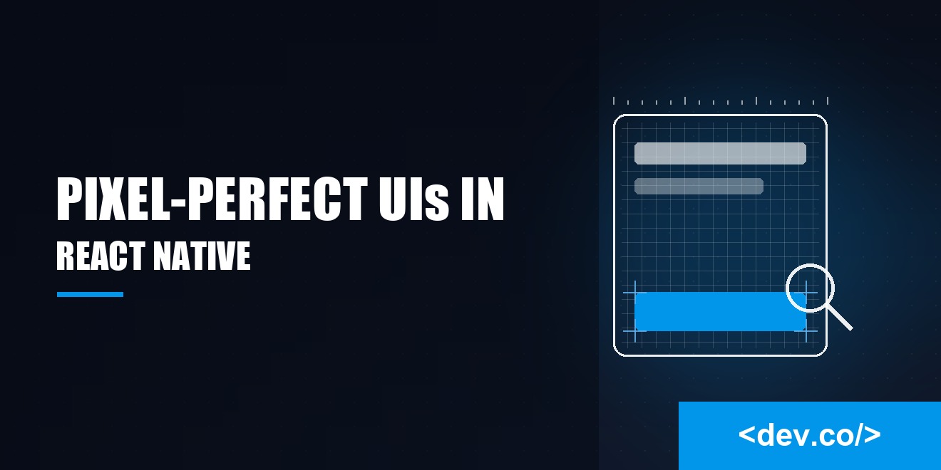
How to Build Pixel-Perfect UIs in React Native with Styled Components
Crafting sharp mobile interfaces can feel like balancing glass plates on a moving train—but it's what sets forgettable apps apart from the ones users truly love. In modern software automation, tools like React Native and styled components offer the precision and control needed to make every pixel count—without drowning in a sea of styles. This guide walks you through how to plan and build with intention, so your components look and feel right across every device.
What Pixel Perfect Actually Means on Mobile
Pixel perfect is not about chasing parity with a single mock. It means the visual intent holds across densities, sizes, and platforms. You want alignment that feels inevitable, spacing that reads as deliberate, and text that looks tuned rather than squeezed. Those details translate to trust.
Think in density independent units. React Native abstracts points so that 16 on one device does not shrink into illegibility on another. Your job is choosing a scale for type and spacing that produces predictable relationships. Once a scale exists, fidelity becomes a habit instead of an improvisation.
Why Styled Components Shine for React Native
Styled components co-locate structure and style, which removes the mental gymnastics of hopping between StyleSheet objects and JSX. The result is a component that explains itself. When a button reads as compact, primary, or destructive, that state lives right where you use it, controlled by props and tokens rather than a tangle of conditional class names.
Styled components also encourage a steady design language. Tokens travel through a theme and get consumed consistently. Because props are typed, you prevent style drift and keep overrides from piling up. The library memoizes generated styles, so you avoid recomputing identical objects on every render.
Theming Without Tears
Create a theme that holds spacing, color, radius, elevation, and typography scales. Feed it into a ThemeProvider and resist the urge to sprinkle literal numbers everywhere. Tokens make intent obvious. Instead of 12 versus 14, you get bodySm versus bodyMd, which tells a teammate what you meant without a sidebar.
Component Boundaries That Encourage Reuse
A well named styled component reads like a tiny contract. ButtonRoot defines layout and hit area. ButtonLabel defines type ramp and line height. Variants hang off props such as size and tone. Because these live together, you avoid the slow creep where every screen invents its own button.
Preparing a Design System That Does Not Drift
Pixel perfection rides on a strong design system. Without one, every change is a bespoke fix. With one, you evolve fast and safely. Think of tokens as the DNA for your visuals.
Set a Baseline Grid and Stick to It
Choose a base unit and commit. Four point grids remain popular because they provide enough granularity to feel flexible while keeping you out of one pixel purgatory. Align padding, margins, and icon sizes to that grid. When in doubt, round to the nearest multiple. The human eye loves rhythm and your team loves consistency.
Typography That Survives Screen Sizes
Pick a ratio, define roles like title, subtitle, body, and caption, then map them to tokens. Set comfortable line heights so multi line text does not look like a traffic jam. If you support dynamic type, test your screens at large sizes and make sure nothing collapses.
Color and Contrast You Can Actually Read
A gorgeous palette is useless if your text melts into the background. Pick accessible pairs for foreground and surface, then lock them into your theme. Avoid defining colors inline. If you need a lighter surface, create surfaceAlt rather than hard coding a hex value.
Crafting Components for Real Devices
Design mocks live in a perfect world. Real devices have cutouts, gestures, and thumbs that miss. Components must tolerate all of it.
Hairline Borders and 1px Problems
On high density screens, a one pixel border can look thicker than intended or vanish. Use hairline width where appropriate, then verify on a phone. If a border is a focus detail rather than a separator, consider upping it to a tokenized thickness so it survives scaling.
Tap Targets, States, and Motion
Touch targets should feel generous. Aim for at least forty four points in both directions and add hitSlop if the visual shape runs smaller. Give every interactive element a pressed state and a disabled state. Motion should be swift enough to feel responsive and slow enough to read.
Taming Layout for Different Screens
Layouts that ignore extreme screens will betray you at the worst moment. Plan for small phones, tablets, and everything in between.
Respect Safe Areas and Notches
Do not fight the status bar and notch regions. Use safe area insets so content never hides under hardware or system UI. Headers should account for these insets automatically through your spacing tokens.
Adapt with Breakpoints and Containers
On mobile, you can think in breakpoints. Use container width thresholds to switch between single and split layouts. Keep a consistent gutter so the page feels airy rather than scattered.
Handle Text Expansion Gracefully
Strings will grow, especially after localization. Design for wrapping and avoid hard width limits on labels. Favor flexible rows that push and pull within a container. When text must truncate, provide a way to reveal the full string so nobody plays guess the label.
Testing Visuals like You Mean It
Visual quality cannot rely on luck. It needs a routine that catches quiet regressions after a quick refactor.
Build a Visual Review Loop
Use component isolation so you can view pieces without navigating the whole app. Review every component in light and dark treatments, large text settings, and both platforms. Keep a short checklist for padding, alignment, and touch targets.
Guard Rails in CI
Automate the boring parts. Add linters that flag inline numbers in styles or contrast ratios that fail accessibility guidelines. Run visual snapshots on a set of representative devices.
Performance Considerations You Will Feel
Great performance is part of polish. Styled components can be fast if you use them thoughtfully. Avoid creating brand new styled instances on every render. Keep variant logic pure and driven by simple props. Large inline functions that compute styles can trigger expensive recalculation. Prefer memoized helpers that translate tokens to style objects once, then reuse them.
Images deserve special care. Render them at appropriate sizes so the GPU does not work overtime. Avoid stacking multiple semi transparent views for layered effects when a single asset will do. Be sparing with heavy blurs and oversized shadows on Android. If a screen feels sluggish, it probably is, and people will notice.
Shipping with Confidence
Before you hit publish, walk through the app like a user. Does the first screen load snappily, with text that resolves without flicker? Do buttons and inputs look consistent across flows? Are modal transitions smooth and predictable? Try the app in harsh conditions like low light, low battery, and low network. Pixel perfect is not only about pixels. It is about the feeling that everything is in the right place, ready for the next tap.
Conclusion
Pixel perfect is a reputation you earn one decision at a time. Choose a clear scale, encode it as tokens, and let styled components express those choices in the open where everyone can see them. Guard your layout against notches, tiny screens, and wordy strings. Give components generous touch, visible states, and motion that helps rather than distracts.
Trim performance costs before they trim your frame rate. Most of all, keep a short, relentless review habit so quality does not rely on luck. Do this and your interface will feel solid, friendly, and ready for real hands. It will not chase applause for flashy tricks. It will earn trust for the small things that always work, one tap at a time. Screening for that kind of habit before you hire saves a lot of pixel-pushing later — our guide to hiring a React Native developer in 2026 covers exactly what to look for.